Teaching the XPLANE Process: Studio X Courses
THE NEED: Studio X — XPLANE’s educational program — offered our well-loved course, Visual Thinking Bootcamp, exclusively as an in-person experience. Due to a global pandemic creating a growing desire for hybrid and fully-virtual events in an increasingly digital-first world, our courses and educational materials needed an update to meet these new demands.
THE SOLUTION: Better define Studio X’s function within the XPLANE structure. Studio X provides thoughtfully crafted, engaging learning experiences that empower individuals from a wide variety of backgrounds with strategies and tools that help accelerate change within their organization using XPLANE techniques… and it’s all offered virtually.
MY ROLE
Brand design
Presentation design
Production assistance
Page layout
Illustration
TEAM
Program manager
Marketing manager
Creative director
Course experience designer
TOOLS USED
Adobe Illustrator
Adobe InDesign
Adobe Photoshop
Adobe Acrobat
Microsoft PowerPoint
Google Slides
MURAL
THE PROCESS: The road to the present day Studio X courses was long and involved, requiring a lot of on the spot learning, patience, and teamwork lead by our program manager.
Beginning back in spring of 2020, the Studio X team identified the need to shift our beloved course, Visual Thinking Bootcamp, from the physical world into the digital sphere. This was our first foray in bringing our teaching online and to the scale of a global audience.
As we created a virtual Visual Thinking Bootcamp, learned more about the world of online courses, and incorporated feedback and insights from students and instructors, the Studio X team identified an opportunity to expand our course offerings.
We honed in on four areas of XPLANE expertise that we believed would be beneficial to a wide variety of learners:
Strategy activation: the process that bridges the gap between vision and implementation that is often skimmed over when visioning for the future state
Storytelling: teaching people how to tell cohesive and compelling stories that will resonate with the appropriate audiences and encourage people to invest in your concept
Facilitation strategy: helping facilitators gain confidence in building scalable workshops by supplying them with the tools that the XPLANE team uses
Digital whiteboard creation: showing people the true power of a digital whiteboard by teaching them how to implement basic design principles to help elevate the experience of their audience and collaborators, create adaptable boards, and boards that are easy to reuse
Once these course topics were outlined, it was time to start creating.
After about a year of working within a limiting design system that was not only too busy, but also relied too heavily on colour and icons, it was important to develop a new system that was easily scalable and more sustainable in the long-term.
While the Studio X program manager and course experience designer worked together to build out course structure and content, I worked under the supervision of my creative director to define the course look and feel. It was important that the design of these courses felt premium, as they were offered at a premium price. Some of the assets required to create these courses include, but are not limited to, things like:
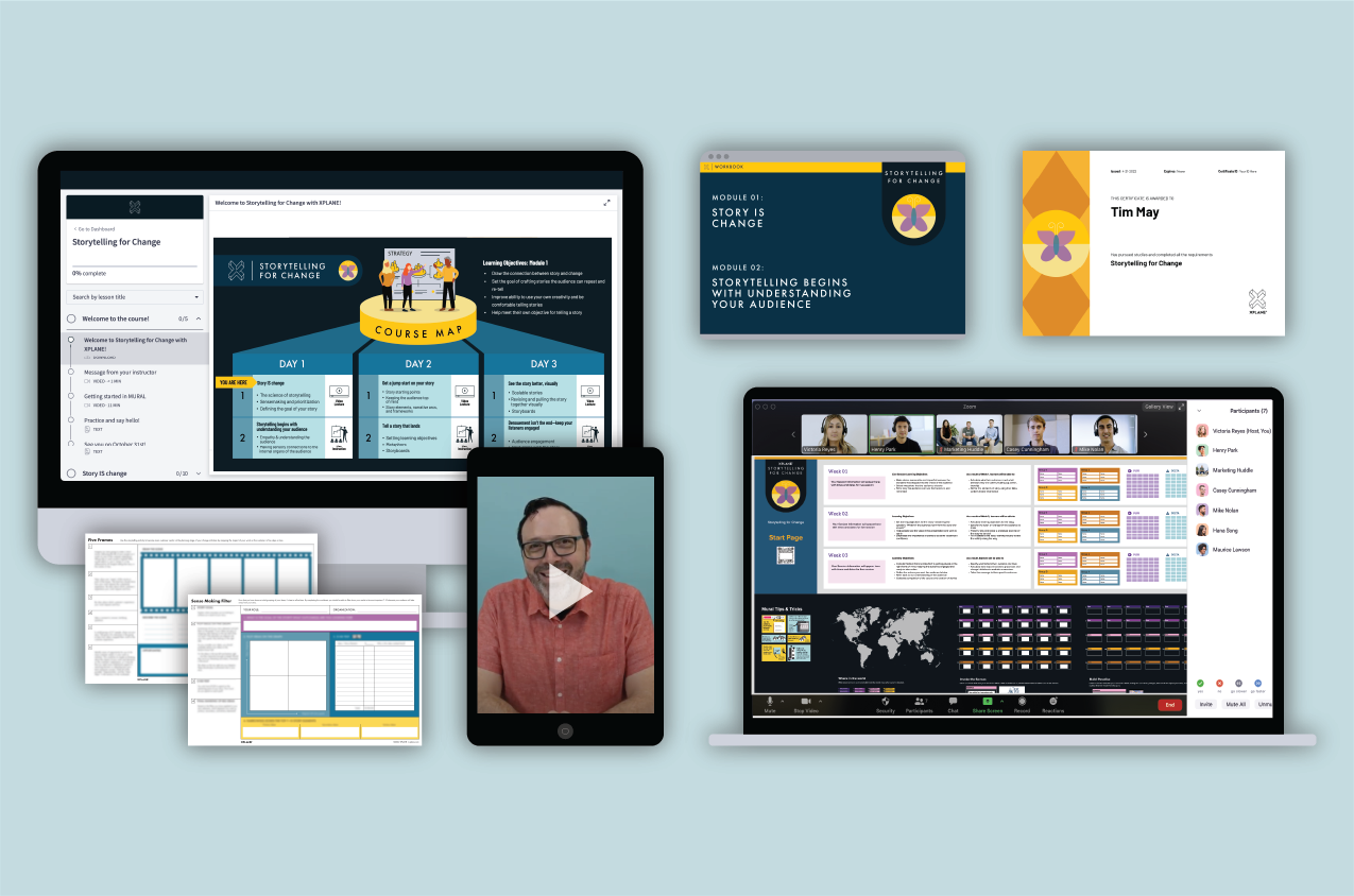
Course map
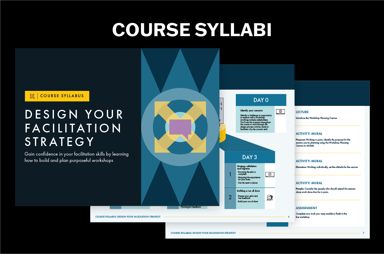
Course syllabus
Sales landing pages
Introduction to course videos
Presentation decks
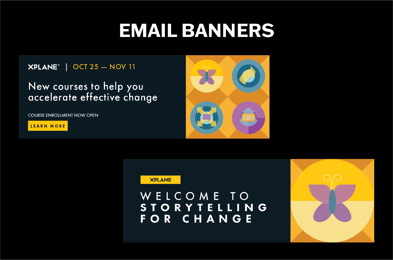
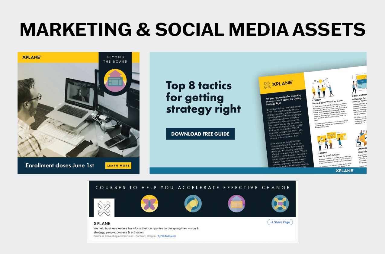
Social media assets
Lead magnets
Digital whiteboards
Worksheets
As much of this content exists behind a paywall, I am only able to show publicly visible content — which is still a robust amount of content that will provide great insight for how this process played out.
THE COURSE MAP:
Each course required its own dedicated course map outlining what to expect in each module and how the modules would be taught. The initial desire was to have a prominent starting and finishing point on the maps, but as content continued to be built, it became clear that something more modular was required and a shift was made to accommodate this need.
THE SALES LANDING PAGES:
The sales landing pages have gone through many iterations as course content has grown and changed. Our team has learned more about SEO and UX, we’ve refined the course content after the first course run, and identified areas for improvement. The initial landing pages were created under a time crunch, and inspiration leaned heavily on other pages within the XPLANE website. After the first run of these courses and a moment to regroup, the page structure was revisited to see what updates were needed.
We collectively identified the need to include:
A video of the instructor introducing the course to familiarize prospective learners with a friendly face
Get rid of unnecessary content and condense content into more neatly organized blocks
Provide more information above the fold to encourage people to continue scrolling
Live sales pages are available for view: Storytelling for Change, Strategy Activation, Design Your Facilitation Strategy, Beyond the Board.
The largest obstacle with the sales landing pages always came back to our need to allow in-the-moment updates, meaning that this page could not be hardcoded by our team’s developer. This meant becoming very intimate with the WordPress plugin, Elementor. Elementor allows for much more flexibility in page layout than is available with WordPress alone, but is a bit of a beast to conquer at first and comes with a lot of its own quirks.
With the revamped sales landing pages, I prioritized:
Including consistent, polished instructor introduction videos above the fold to encourage learners to continue scrolling
Highlighting key information as soon as possible
Simplifying the design and layout of the pages with a more uniform grid system
Adding more value to the simplified course maps by showing icons indicating the style of learning for the module
Condensing lead magnets and other downloadable assets into a contained block for easier navigation
OTHER ASSETS:
Many assets across PowerPoint, WordPress, Thinkific, MURAL, email marketing, and social media were required to bring these courses to life, but it was integral that as much as possible was modular. The greatest task for me in creating content throughout this process was making assets that are non-designer-proofed. Assets that were created in pursuit of this include:
Eye-catching cover pages for course syllabi
Tabs calling out bonus content, action items, lesson outcomes, etc. in PowerPoint decks
Compelling and informative illustrations that mirror the instructor’s script
Informative graphics for marketing and social media campaigns
As I built course assets, I wanted to be sure that I was keeping accessibility, diversity, inclusivity, and equity at the top of my mind. This meant considering things like:
Ensuring that copy was legible at the appropriate scale
Showing a range people depicted in illustrations, as well as avoiding ableist, racist, or otherwise discriminatory imagery
Using colour combinations with high enough contrast
Utilizing alt text as frequently as possible to make content screen-reader friendly
Employing captions on all video content
Working with team to make updates to any potentially offensive content
FINAL SOLUTIONS:
Course Maps
Landing Pages
Silent scroll through of the Storytelling for Change sales page
Silent scroll through of the Design Your Facilitation Strategy sales page
